Frostine
Branding, Website
[Brand Identity]
Client : Frostine’s by LG Household & Health Care, Seoul
Design : Integral Associates, Inc., Seoul
Project Management :Sang Eun Yoo, Borami Kang
Creative direction : Seung Woo Hong
Graphic Design : Aeran Kwon, Yela Lee
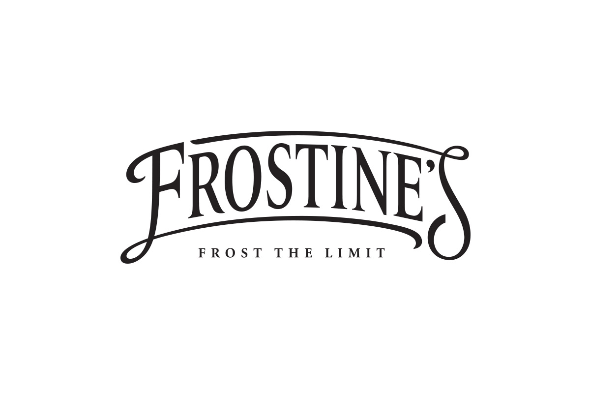
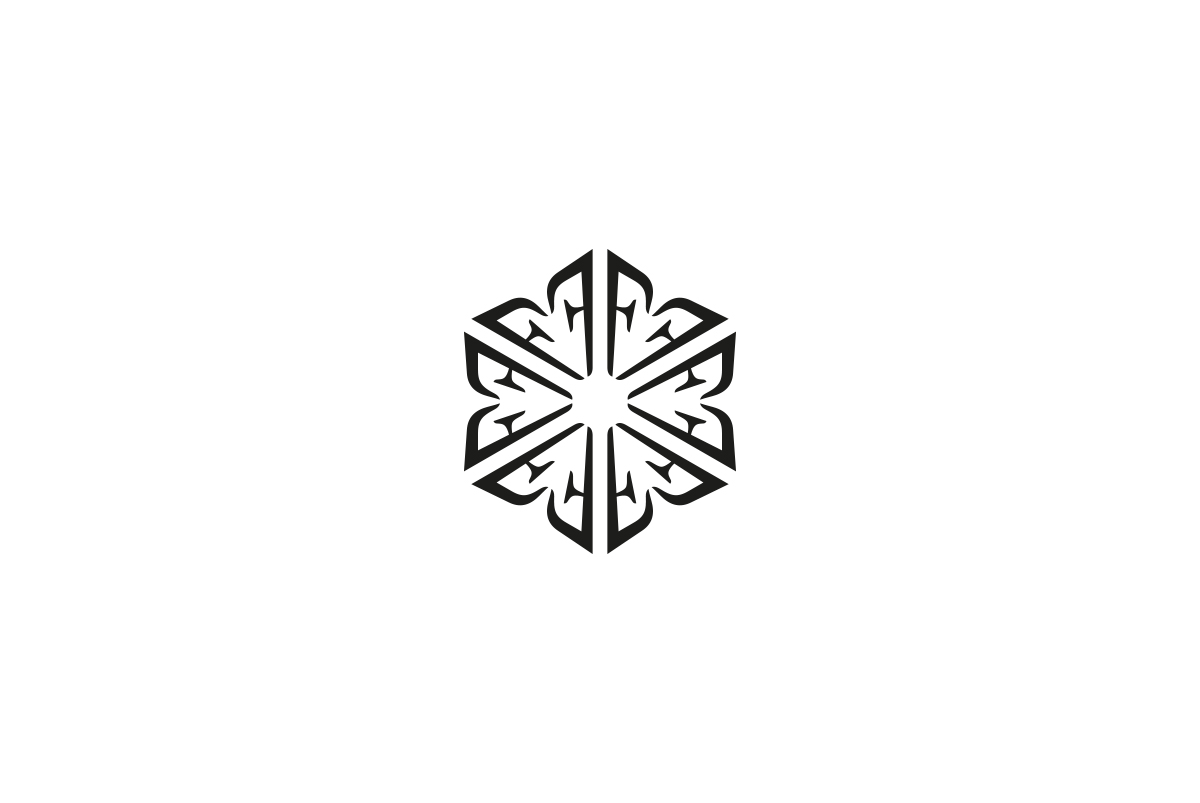
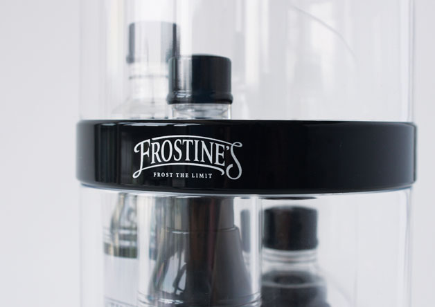
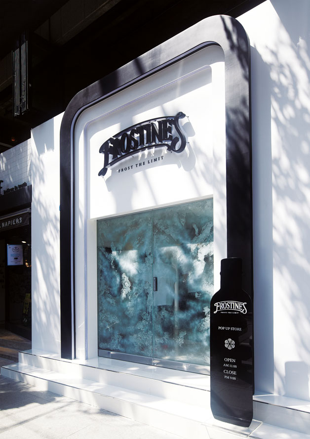
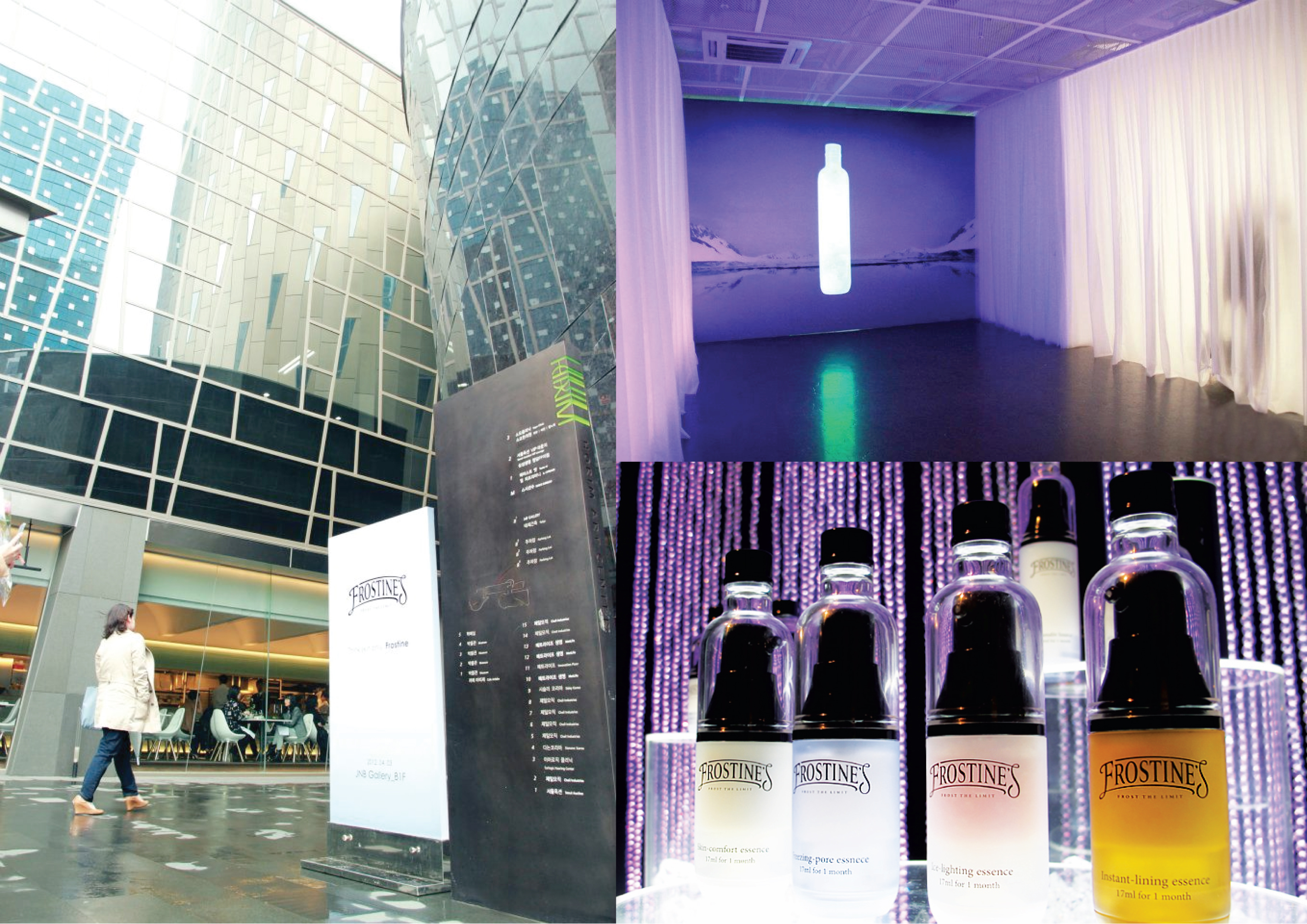
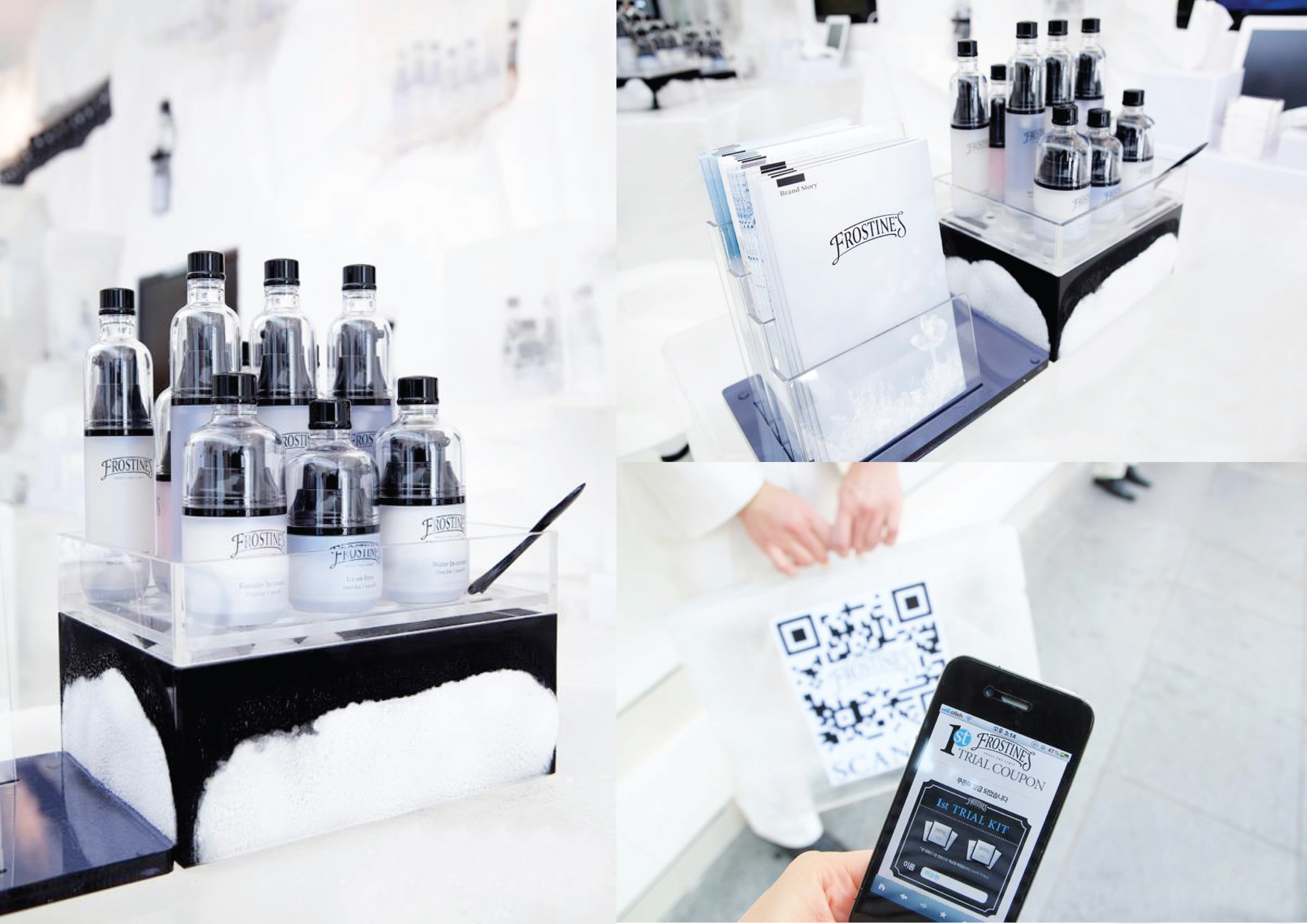
Frostine’s is an innovative series of cosmetics – or “icemetics” – whose ingredients become active when kept cool. Free from antiseptics, it is manufactured and transported in cold storage and needs to be used within a short time. The logo with its arch-shaped typography is reminiscent of European vintage style. It emphasises the brand promise to provide youthfulness especially for women. Further icons, such as the ice crystal made up from the initial “F”, symbolise beauty preserved by the cold and a crystal, clear skin.
Click here for Reddot Award